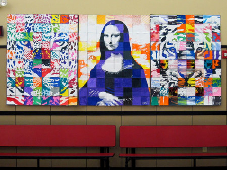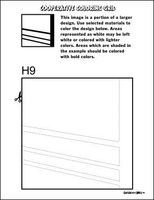
Each grade level had time to complete a coop design. (6,7,8) For the tiger and leopard, students could choose their colors and materials but they were instructed to color the appropriate portions dark or light according to the example on their tile worksheet. There are always a few who fail to follow through on this. They either reverse the values or choose colors that have almost no value difference. This makes the image less clear so those always need replaced. On the Mona Lisa poster, students were instructed to use violet, black, orange, and yellow only. Areas indicated as black were to be violet or black marker while areas containing hatching were to be colored with yellow or orange marker or colored pencil. White areas were not colored.
Another issue I became aware of is that some printer settings have a default “fit image to page” setting. Depending on the set margins, this can cause the handouts to be shrunk slightly resulting in tiles that are not quite six inches. This is really only a problem when applying the tiles to a backing sheet that has been gridded, or if one uses more that one printer. The latter could result in two different sizes of tiles, making it difficult to assemble. Watch your printer dialog when printing and uncheck any re-size or zoom settings.

